Brand visual system
One brand, four directions
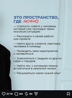
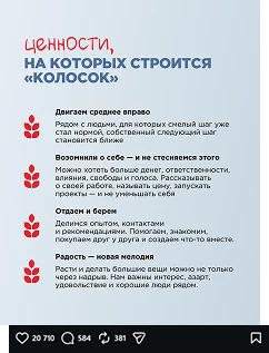
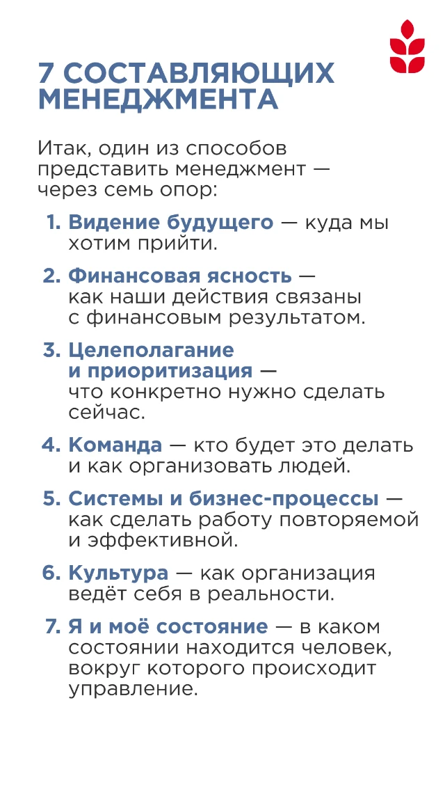
I developed Kolosok’s visual system for YouTube, educational products, and the community. All directions kept one logo, a shared compositional logic, and a common graphic language, while each got its own colour and character

regular content and YouTube

a separate rubric and course

a calmer educational course

materials for community members
Task
Kolosok already had a logo and a base palette. They needed to grow into a system that works across different media and helps distinguish products within one brand
The system had to be recognisable without turning all materials into identical layouts
Not four identities, but one flexible system
All directions keep the logo, typography, compositional rhythm, and graphic language. What changes is the proportion of colour, backgrounds, accents, and the set of media
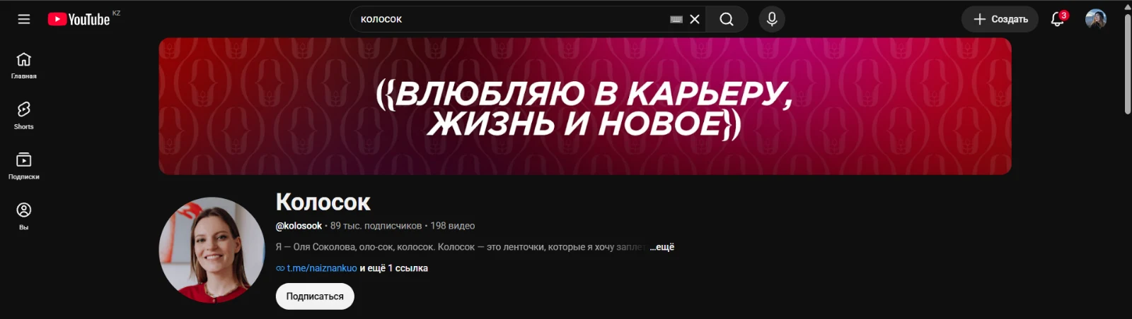
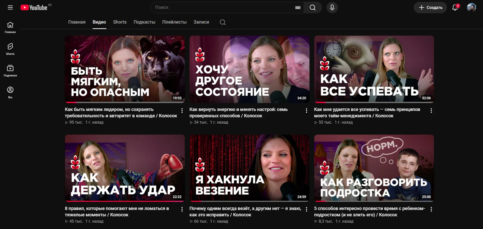
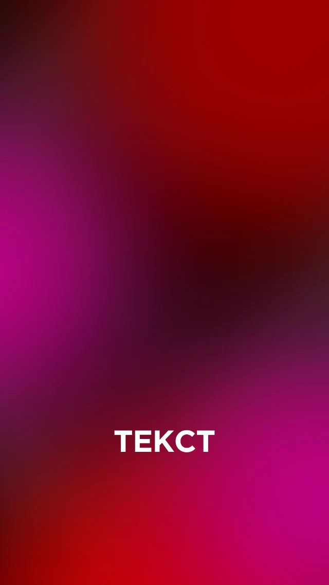
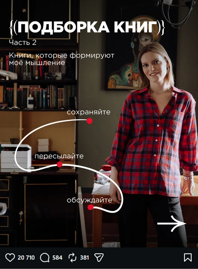
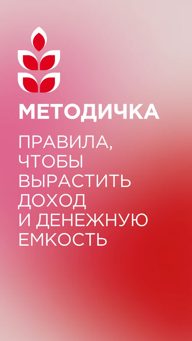
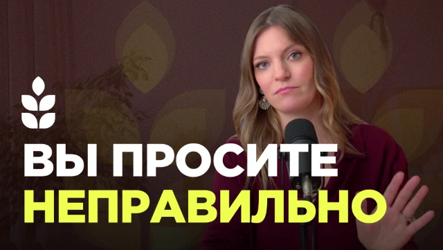
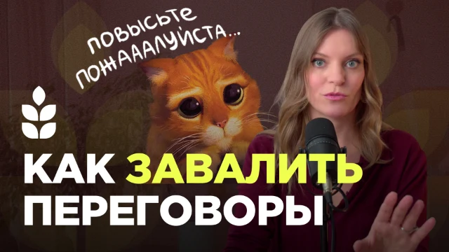
Main Kolosok
A visual system for the channel’s regular content, from the first touch in the feed to the video’s design











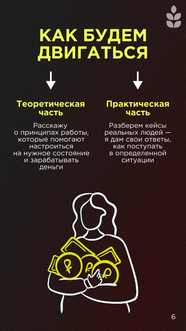
Super Income
A separate rubric and an educational product within Kolosok’s shared system






Open Management
An educational direction with a calmer visual pace and a green colour environment


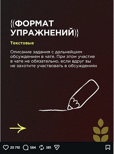
Kolosok community
Materials for community members: a calm visual environment with a recognisable connection to the main brand