
Identity for a community
Two logo concepts and an identity for a community about relationships and communication


The challenge
Convey care, respect for the person, and attention to relationships through the community’s visual image. Develop an identity that unites event announcements, educational materials, and the channel design
Two images of one idea
I developed two marks, each revealing the community’s theme in its own way. Both concepts were used in the project’s design

A heart silhouette is merged with a hand gesture. The familiar symbol of love gains an additional meaning: attention, support, and human contact.


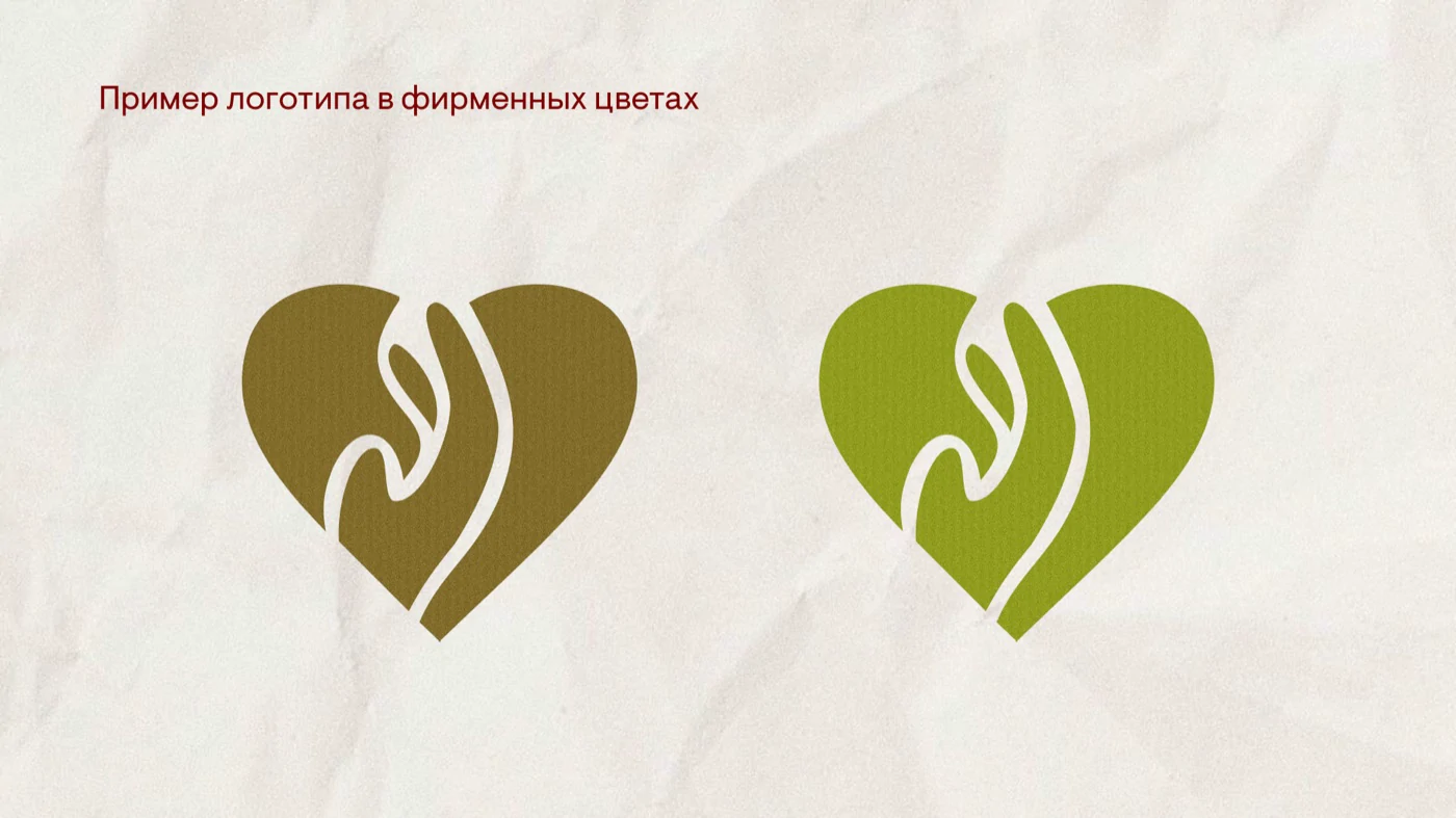

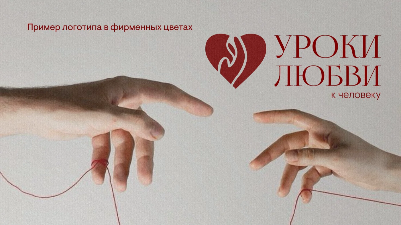


The logos work both in the full version with the name and as standalone symbols. In posts the mark becomes an additional graphic accent, while typography and colour keep the materials connected

A human figure is joined with a plant motif. Organic lines connect the human image with the themes of growth and care.
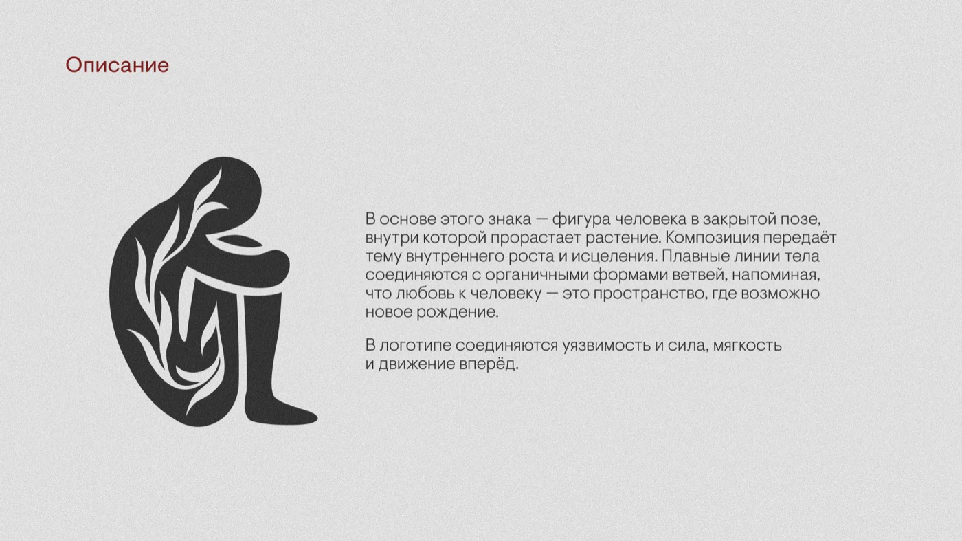


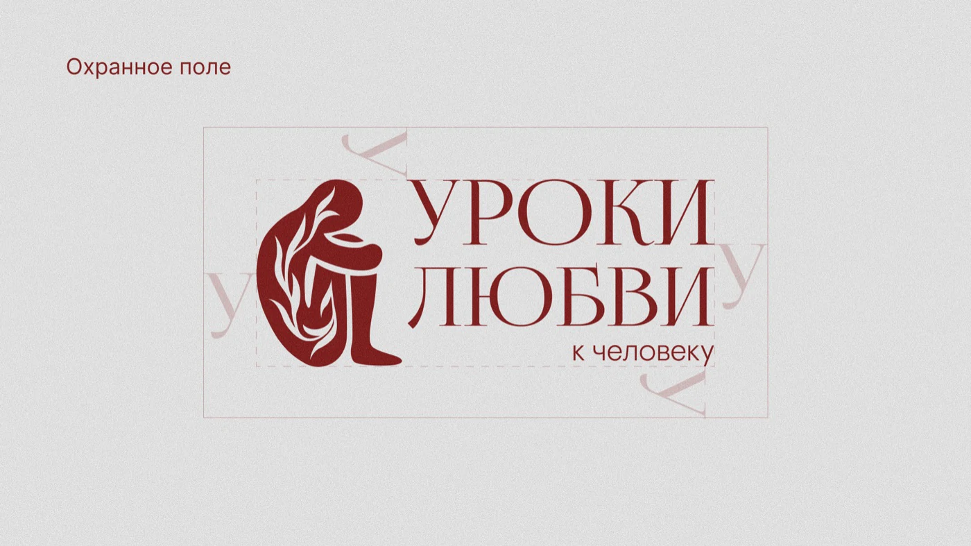


The logos work both in the full version with the name and as standalone symbols. In posts the mark becomes an additional graphic accent, while typography and colour keep the materials connected