
Website for an online course
kolosok-zapleti.ru/openmanagement
Responsive landing page for an online course
The challenge
Assemble an information-rich course page: present the learning formats, testimonials, the detailed curriculum, and payment options. Keep the brand’s visual style and make the content comfortable to read on a computer and a phone
Identity in the interface
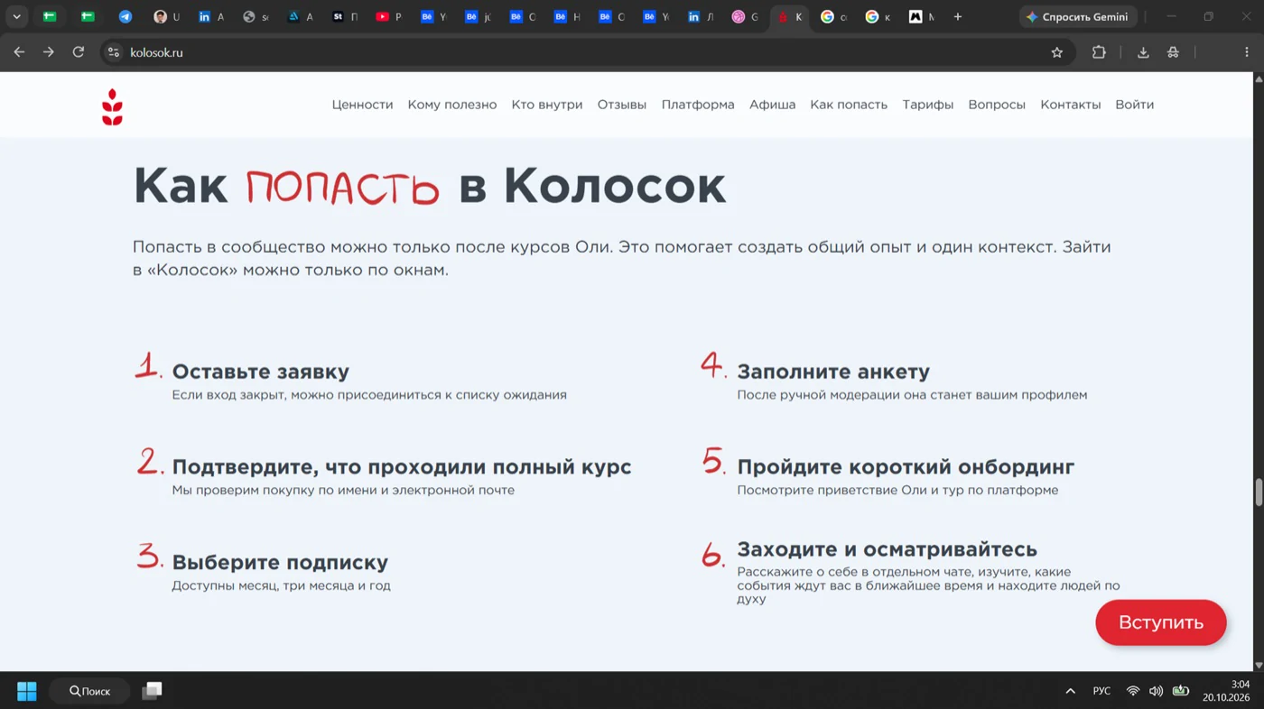
I adapted the identity I had developed to the landing page’s needs. Green gradients unite the page, light cards separate the content, and lime accents highlight buttons and key offers
The ear of wheat works as a brand mark and a large background element


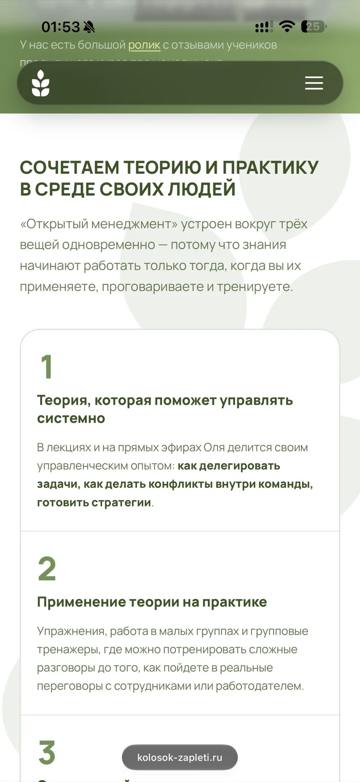
A large volume, on demand
I laid out the detailed curriculum in expandable blocks. Testimonials got a slider and full-text expansion, and the FAQ got its own accordion
A visitor can scan the essentials first and then dig into the section that interests them
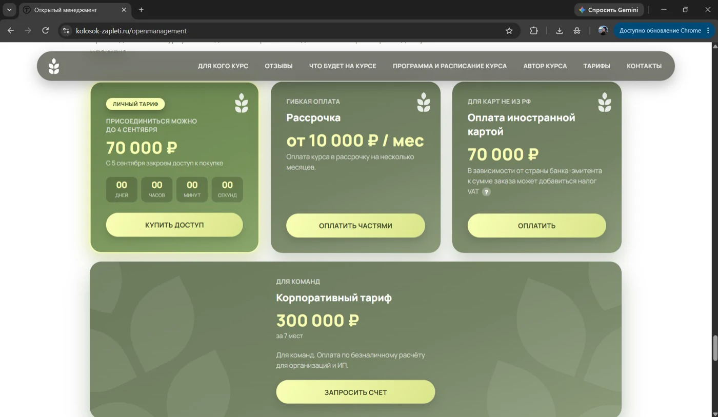
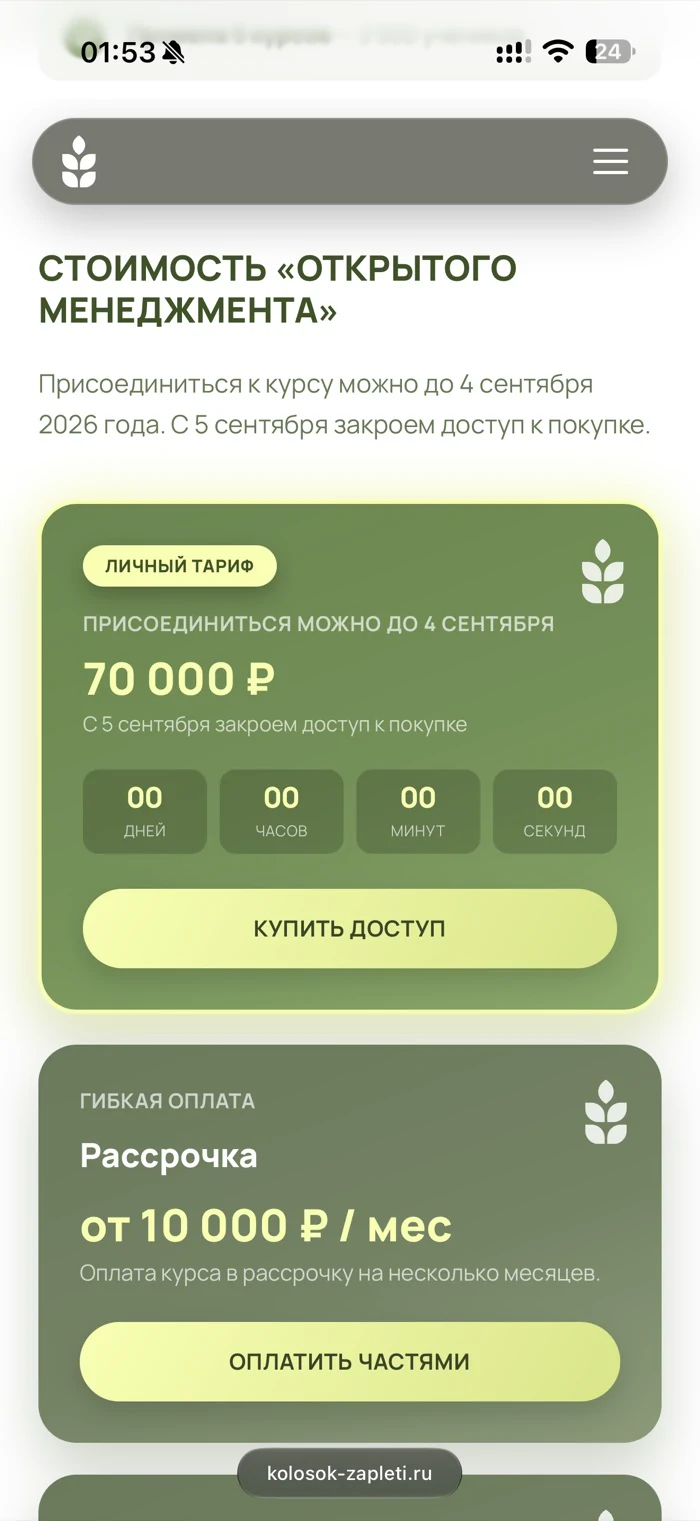
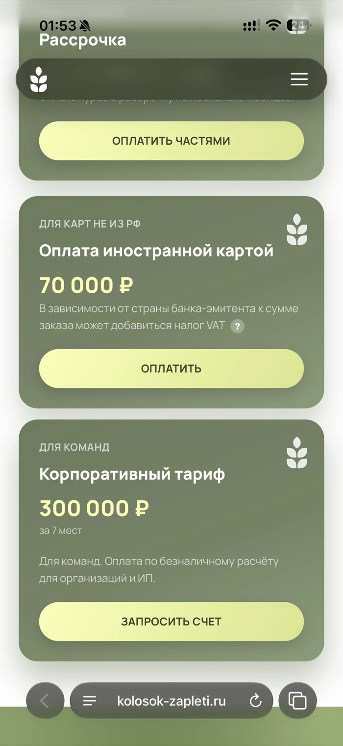
A clear choice of payment method
I split the payment options into separate cards: full price, instalments, and a foreign card. Corporate participation became its own block
Prices and buttons take the first level of attention, with explanations next to the relevant option
From design to a working page
I built the landing page in Tilda myself, set up the navigation, expandable blocks, galleries, and checkout links. The work, from laying out the finished content to implementing the page, took one week