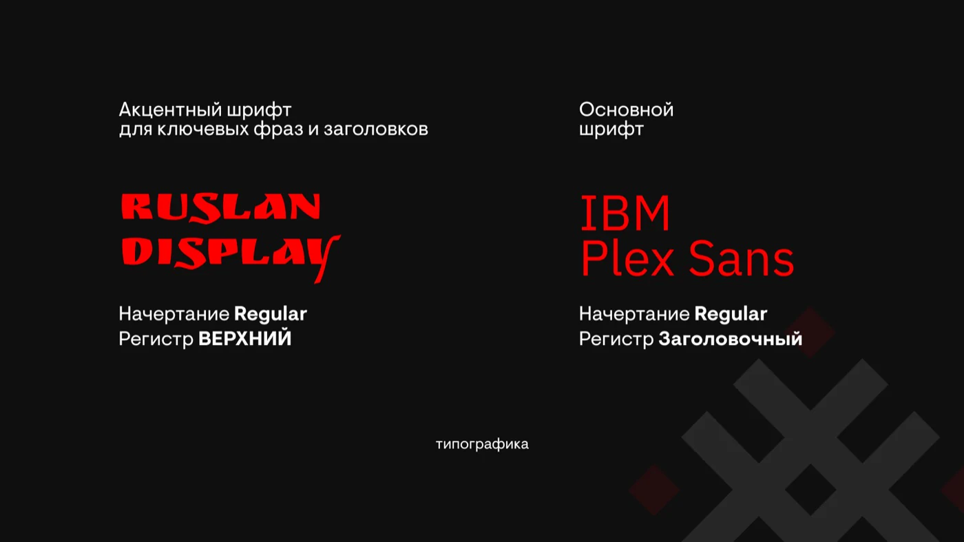
Identity for a production bureau
From two visual concepts to a custom logo and a graphics system for digital platforms


production bureau


production bureau
The challenge
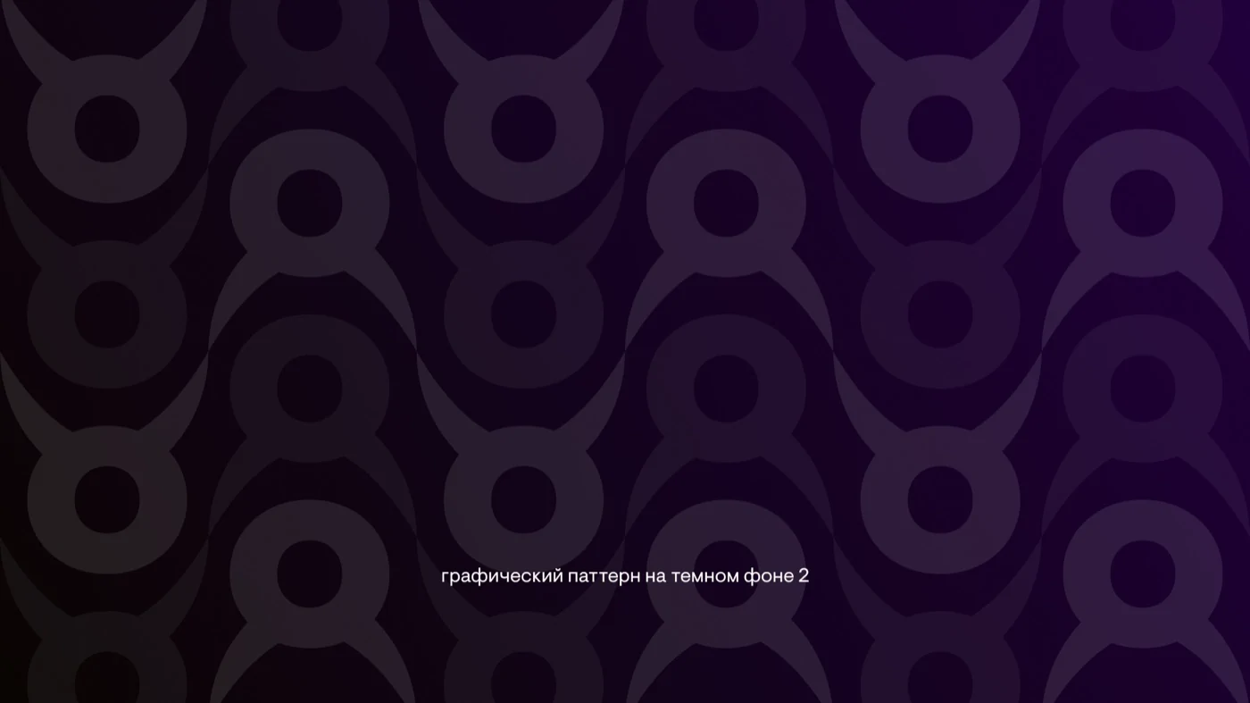
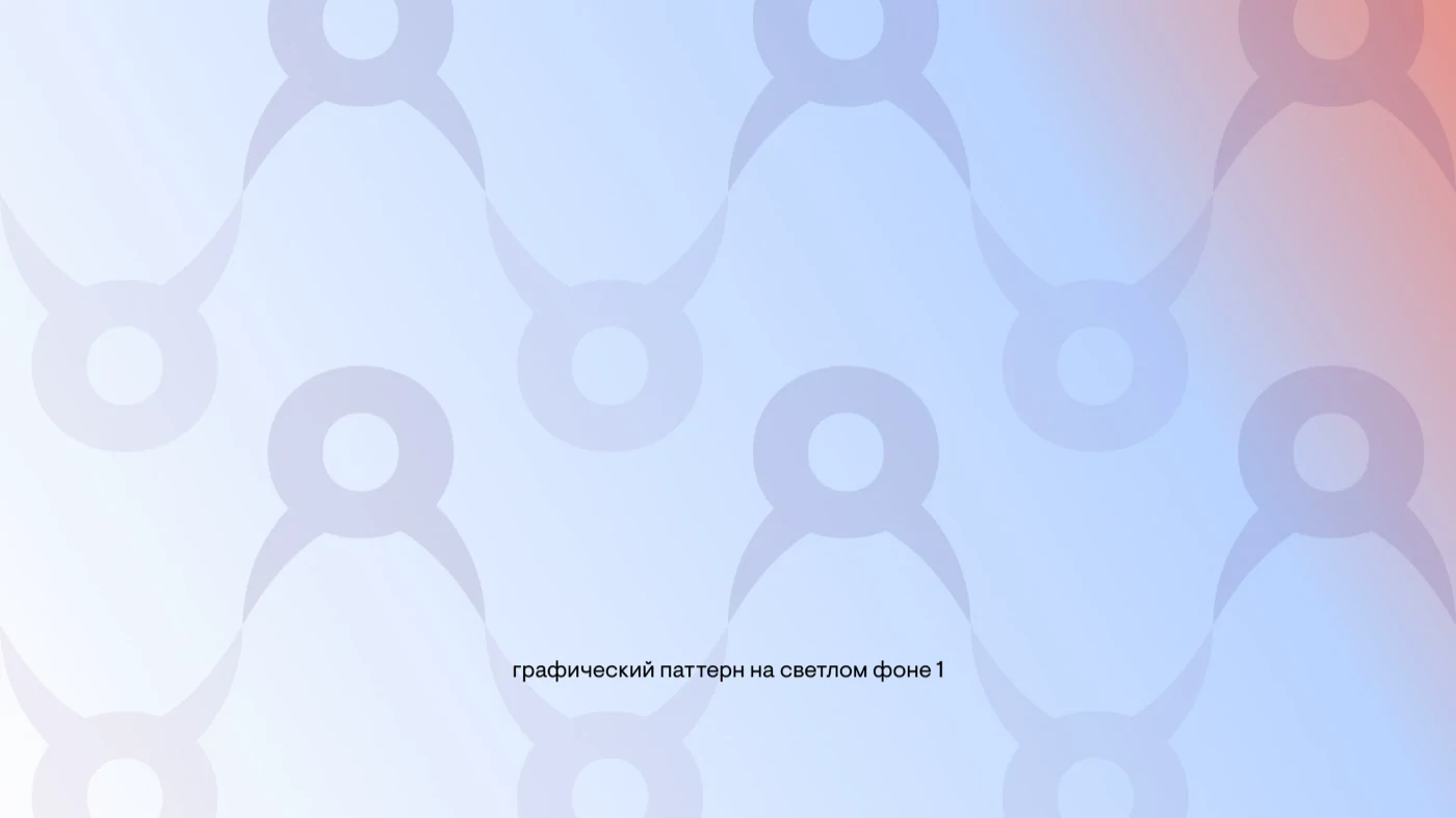
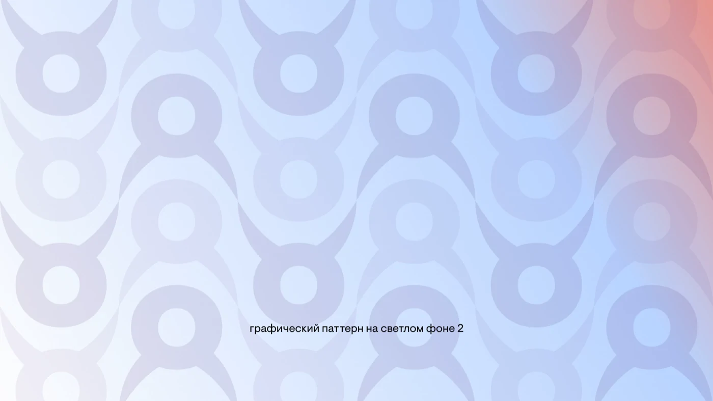
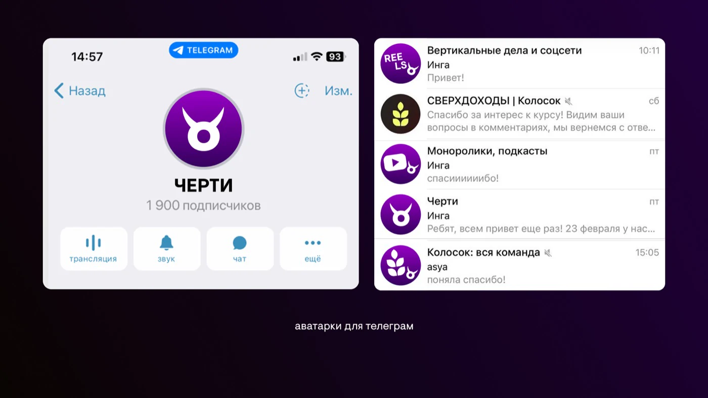
Convey the boldness and self-irony of the name while keeping the composed image of a production bureau. Create a style that works in a logo, small avatars, and wide banners
From research to direction
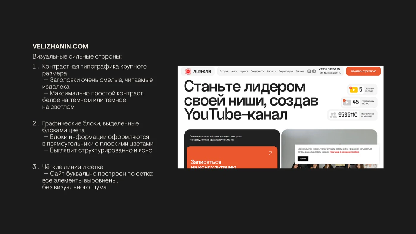
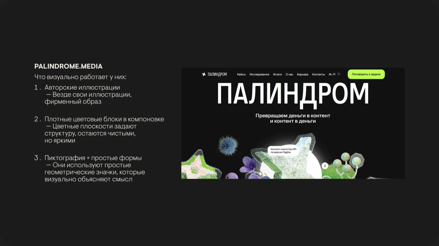
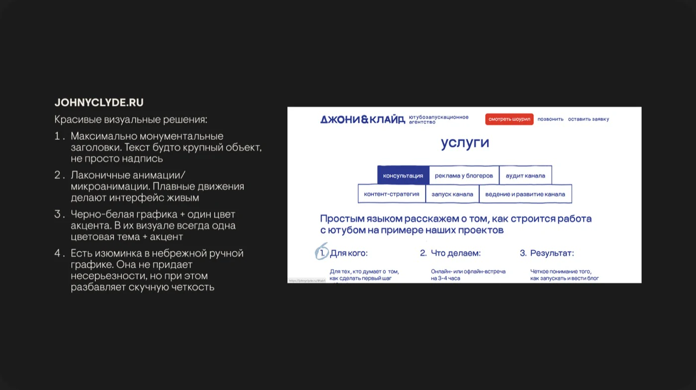
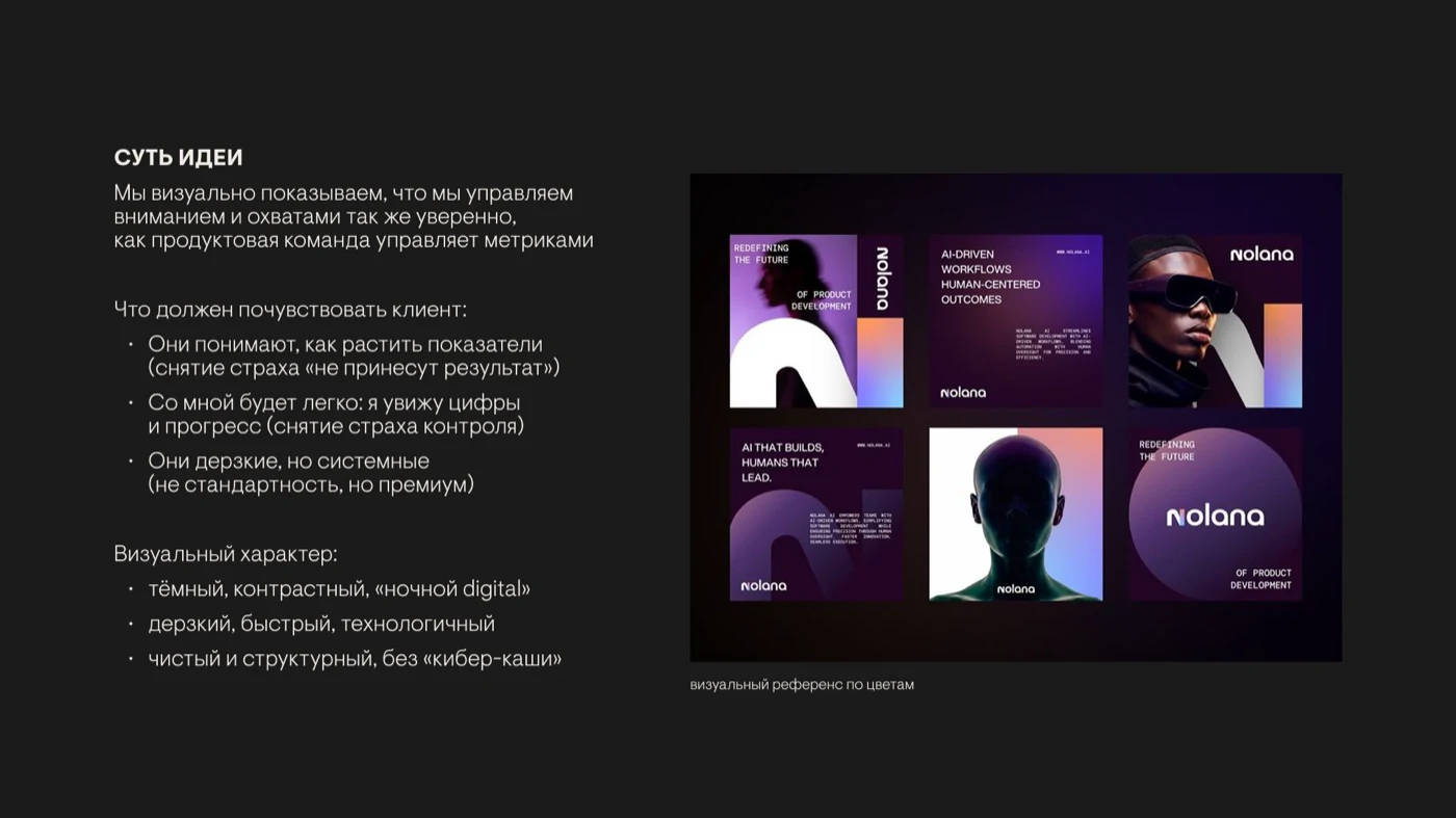
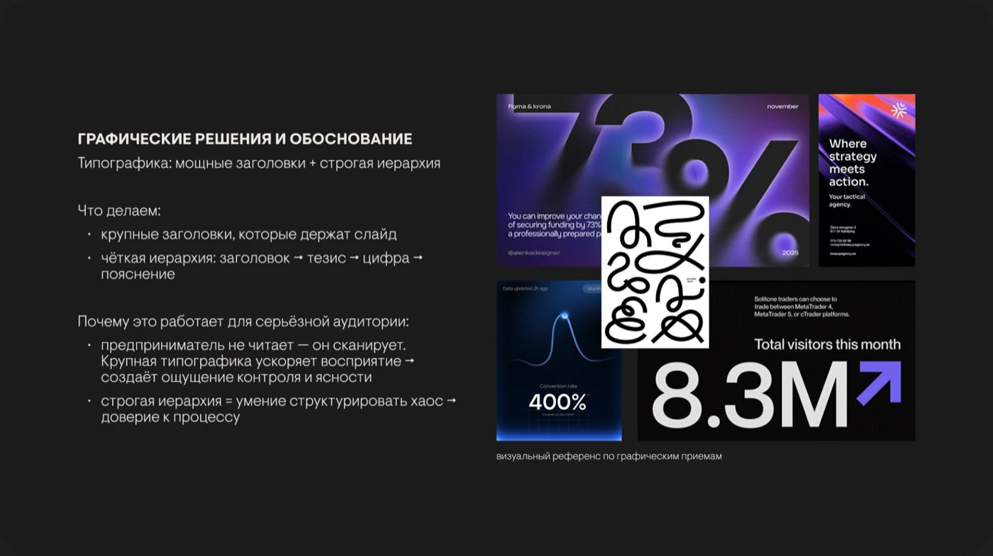
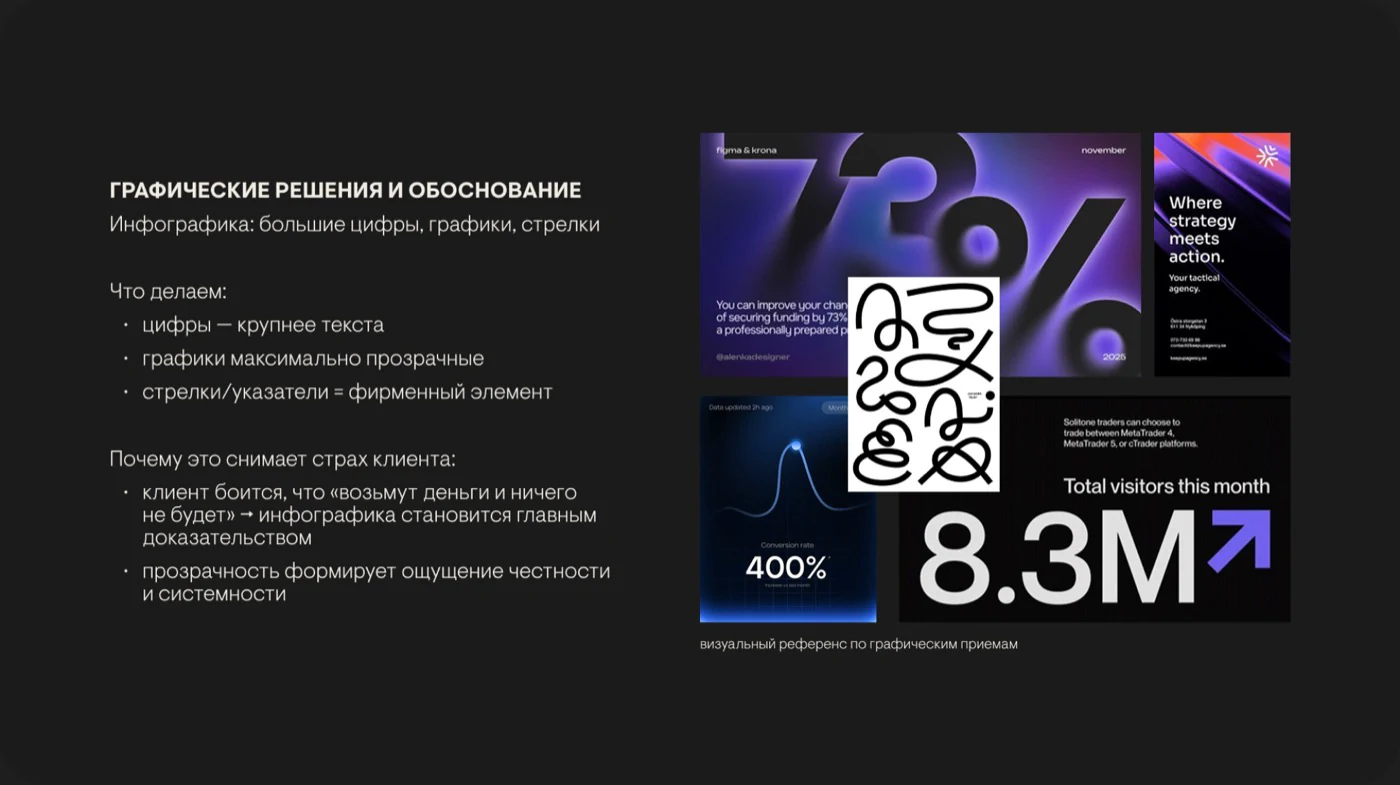
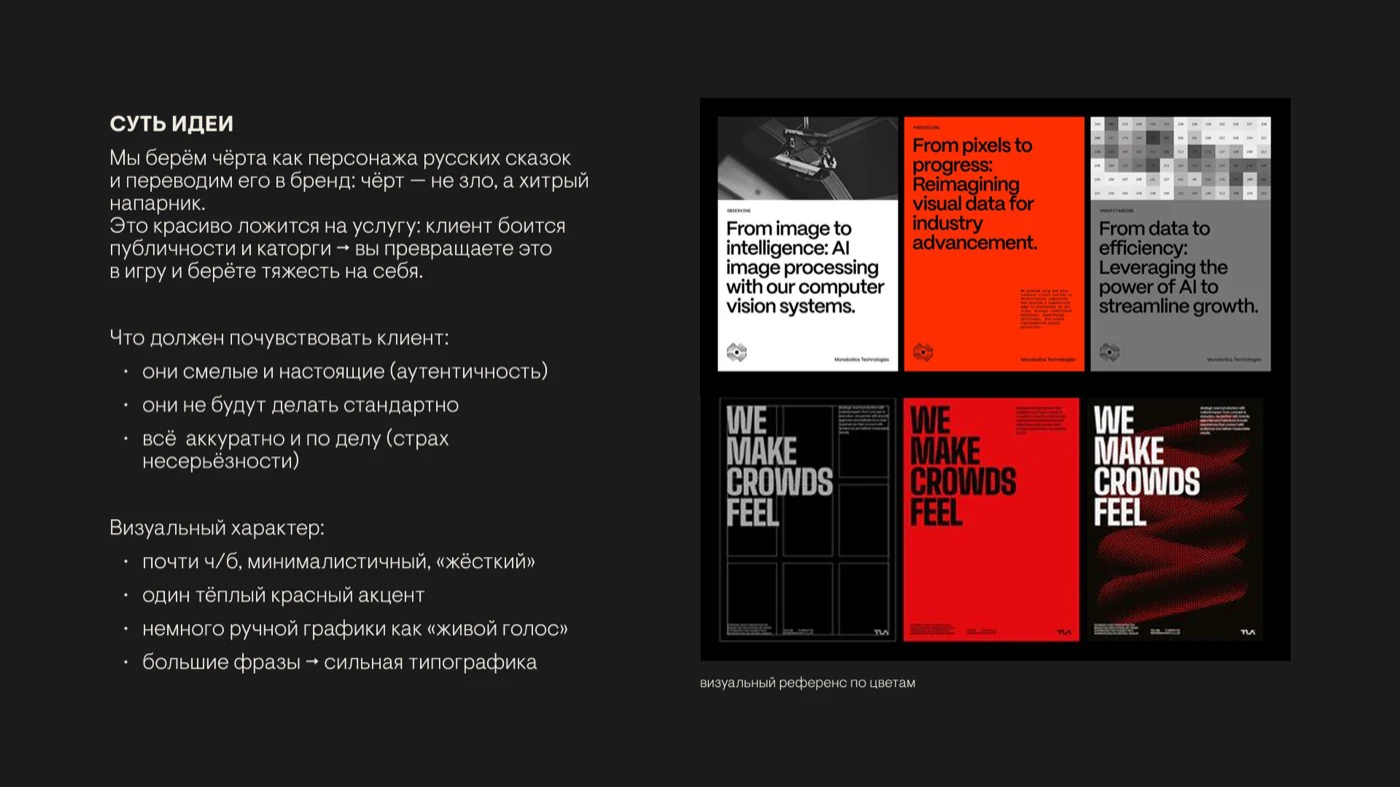
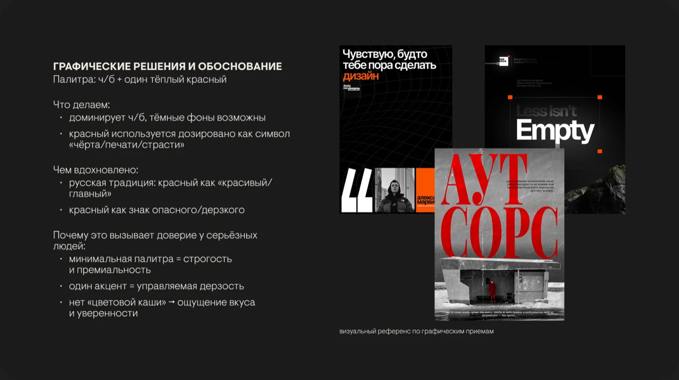
I studied how other bureaus use visual devices: large typography, contrasting blocks, custom graphics, and a strict grid
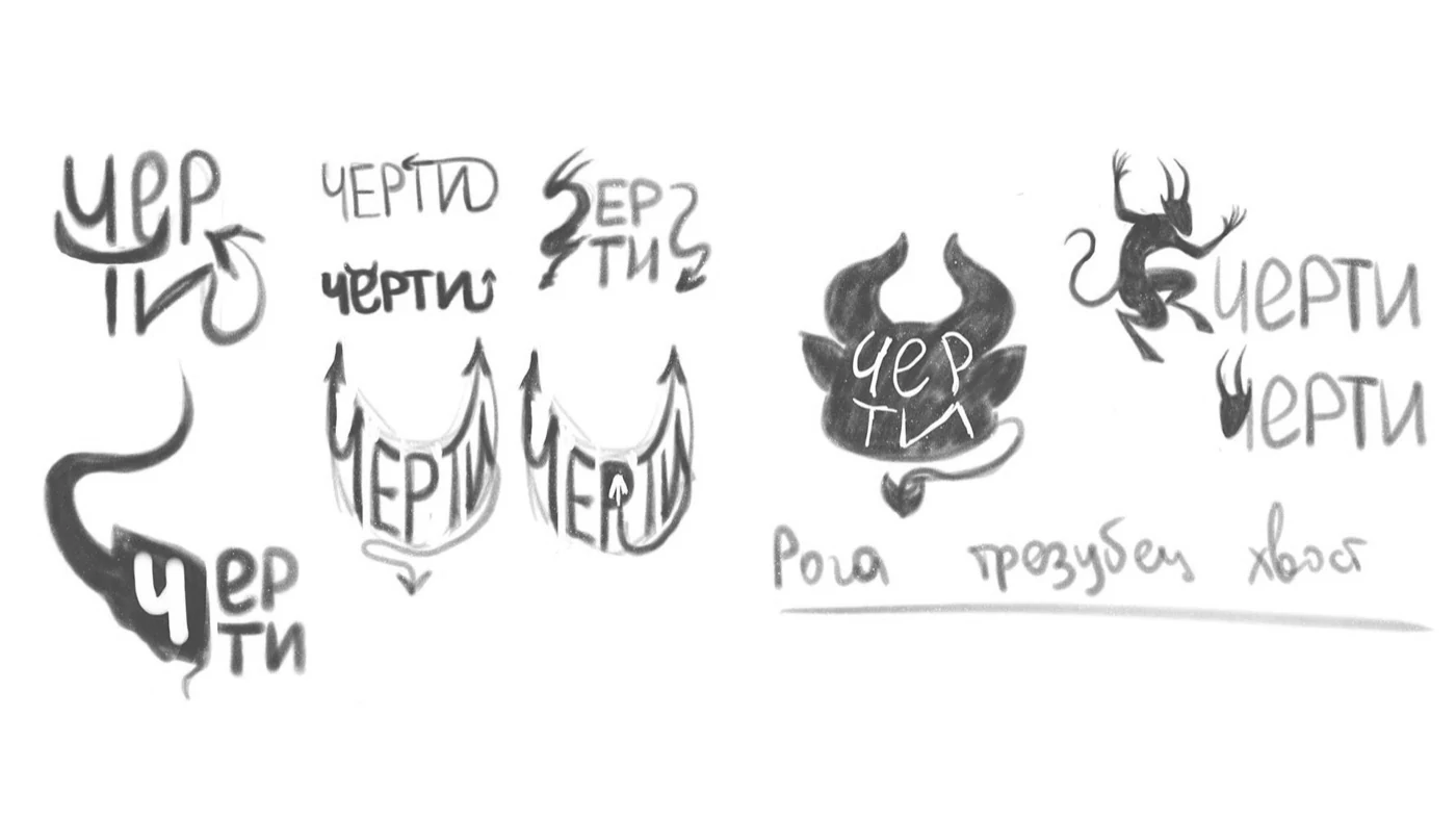
For Cherti I chose a combination of clear composition and an original graphic motif tied to the name. That became the basis of both concepts
Two takes on the “chertovinka”
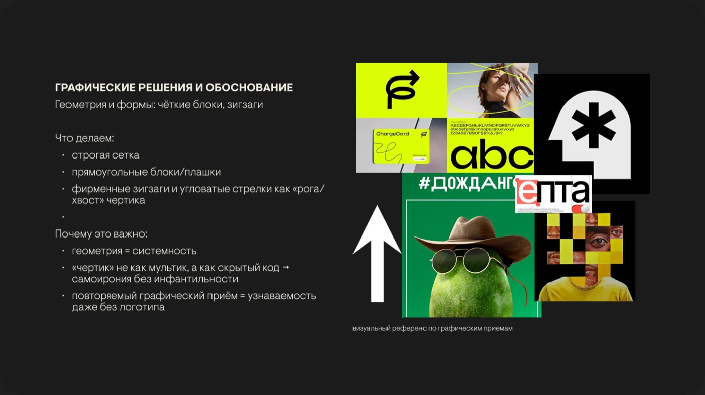
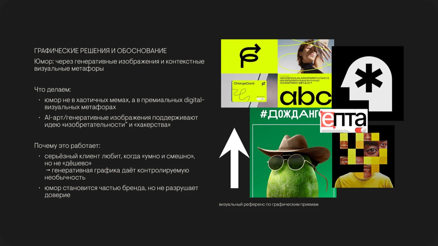

“DEVIL WAVE / THE REACH HACK”
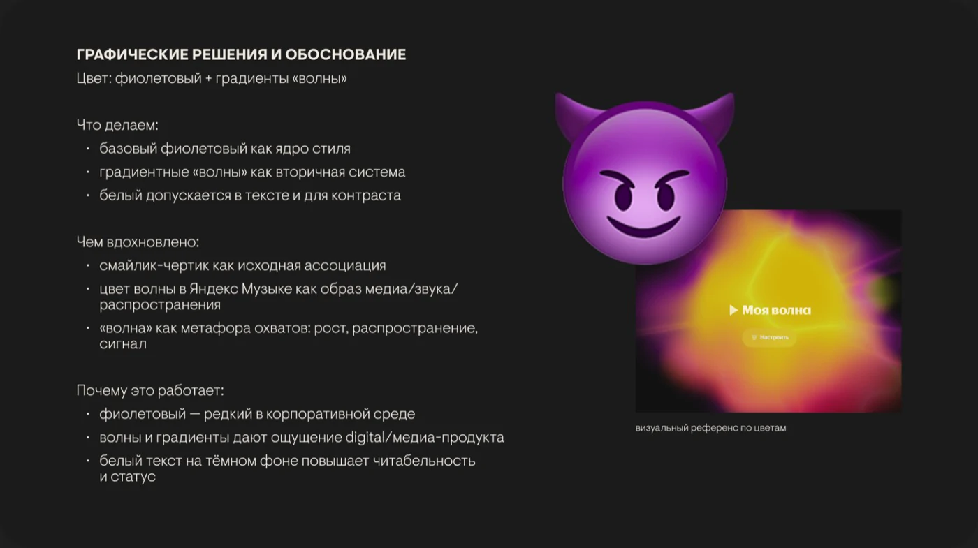
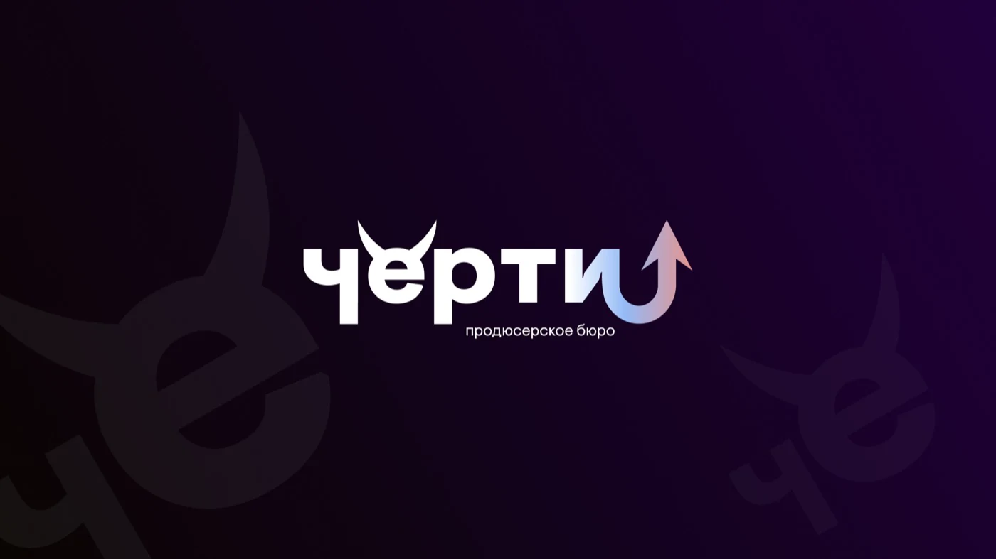
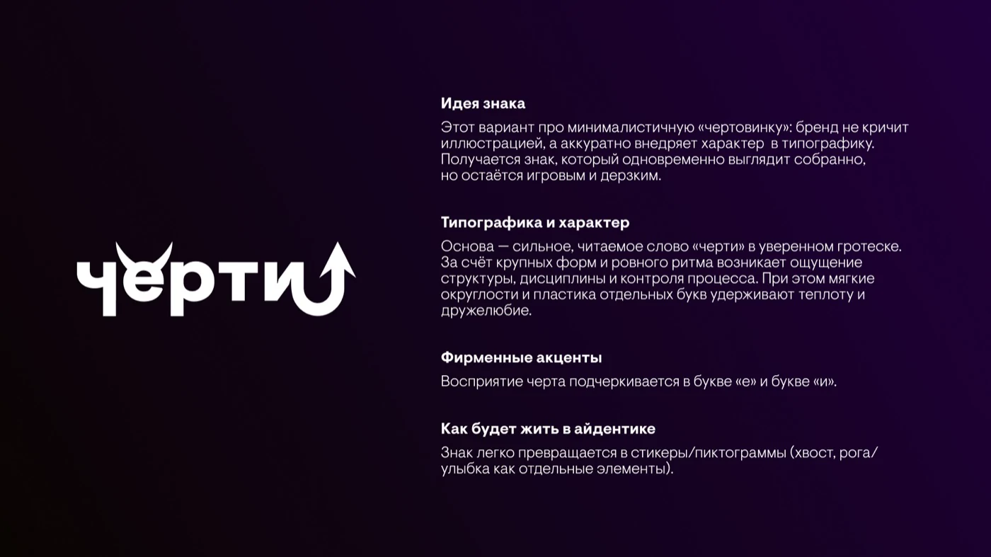
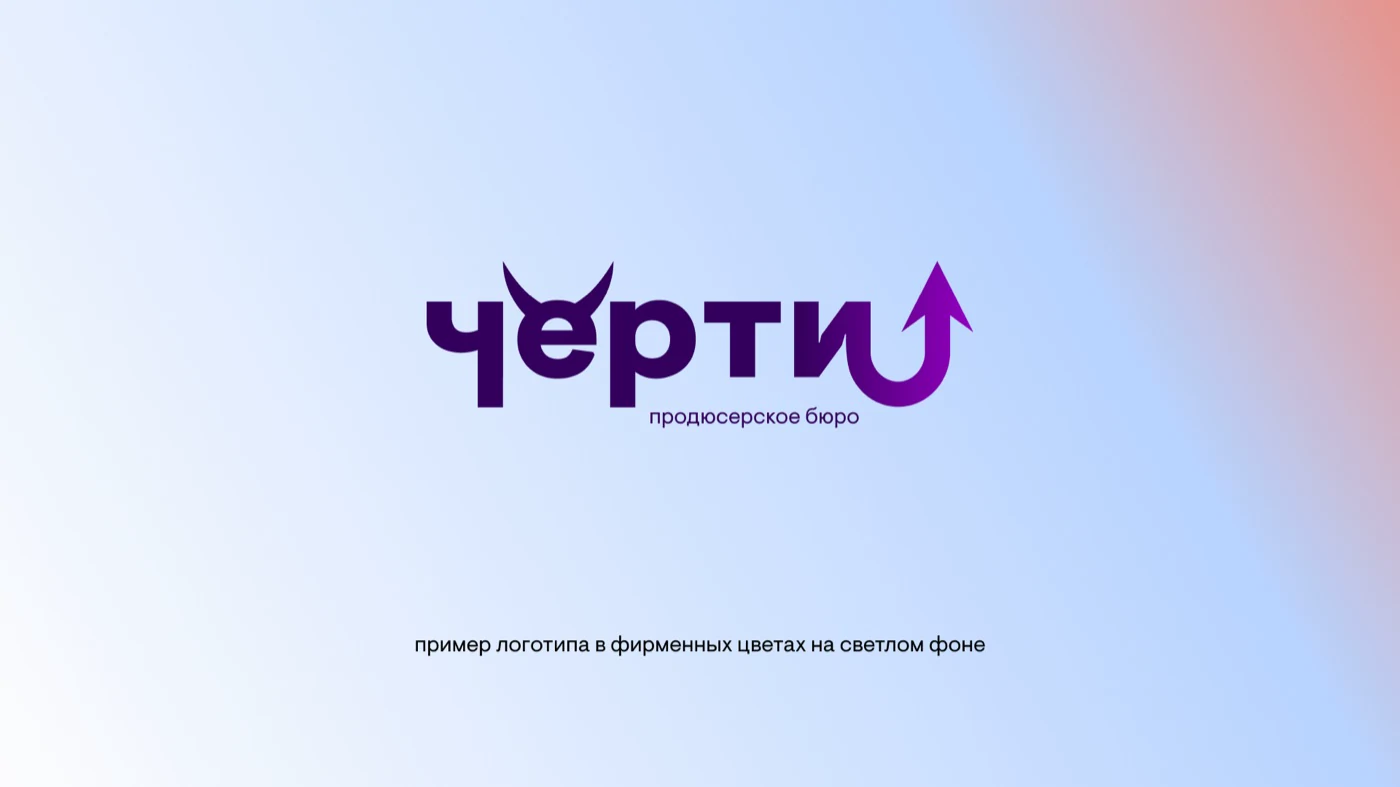
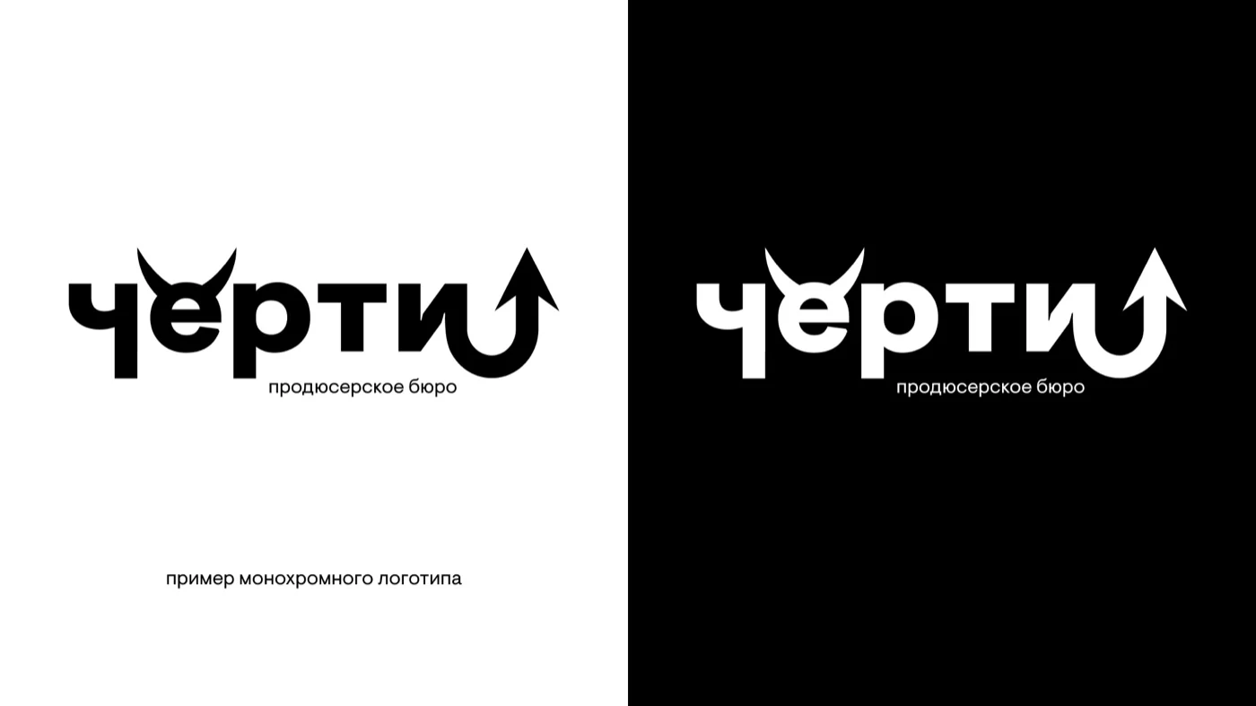
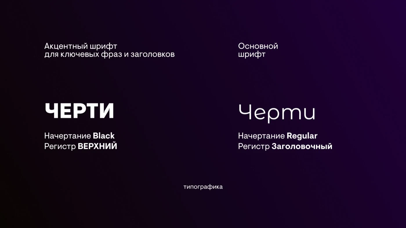
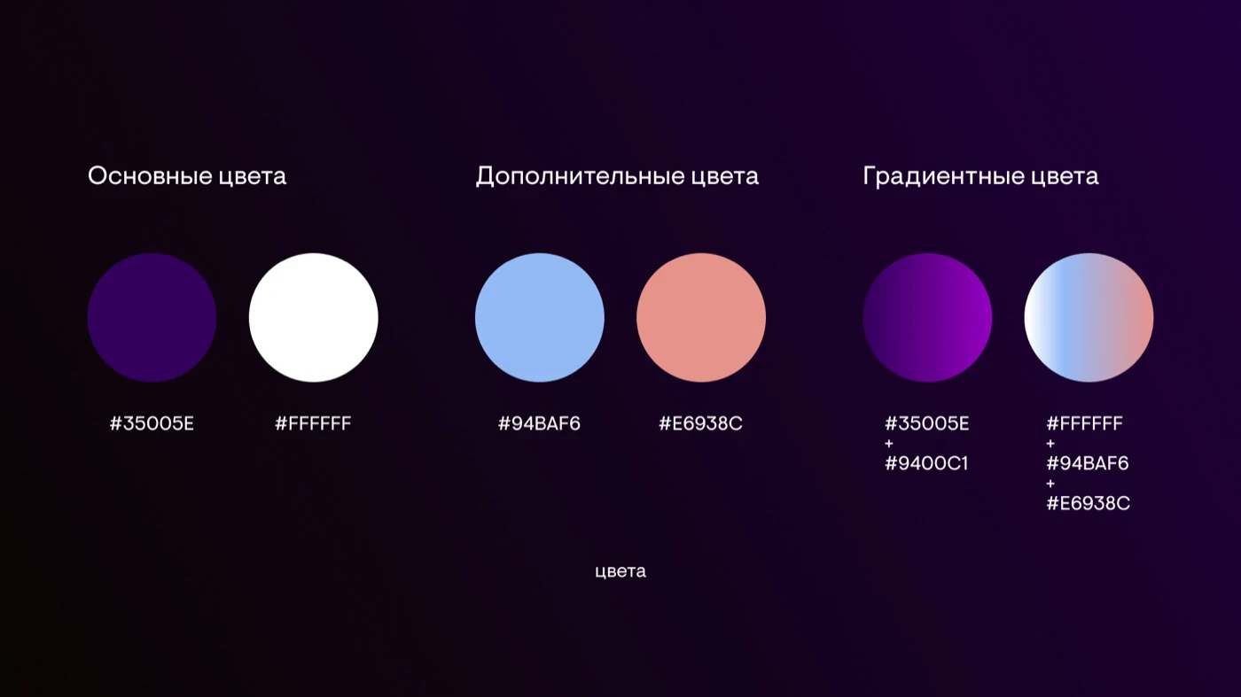
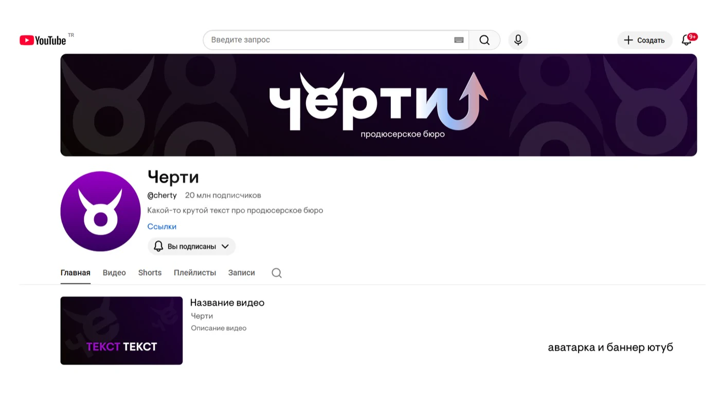
A violet palette, gradients, and concise typography. The brand’s character is built into the letters: horns and a tail become part of the word


“FAIRYTALE DEVIL / RUSSIAN IRONY”
A violet palette, gradients, and concise typography. The brand’s character is built into the letters: horns and a tail become part of the word